With another Clerkenwell Design Week finished, it’s time to look back on what the world of workplace design is working on now, as well as what it’s hinting at in the future… Many of the trends we noticed last year have crystallised into the norm, including the focus on different workstyles, furniture aimed at wellbeing, and a certain plushness and charm to entice people back into the workplace. We think we’ll see these trends evolving further over the course of the year and continually refining themselves, a sense of ‘evolution not revolution’. Here are a few of our highlights:

Brunner’s neutral colours with stand-out solutions
Brunner had a lot to talk about this year. Not only are they celebrating 40 years of stylish design, but they’ve just opened up a showroom to match. Architects, Mcdowell + Benedetti, have skillfully converted an old cinema into a beautifully understated gallery-like space. The use of subdued monochromes helps the furniture to make an impact, especially with the restrained elegance in new products such as Halm (recent winner of a Red Dot Award).
They’ve also branched out with an interesting take on the traditional cellular office called, wait for it, Cellular. This customisable system works in a honeycomb structure, allowing users to combine different ‘cells’ dependent on their work activity – from private spheres in larger areas to meet-and-greet zones. The high-backed privacy panels divide the spaces without isolating the modules from their surroundings. This makes cellular well-suited not just to open work areas, but breakout and reception areas too.

Frovi get flexible
When entering the showroom of Cotswold-based Frovi, it’s apparent that the product development team are taking flexible working very seriously (serious in a playful manner that is). The first thing we noticed was the mix of colourful spaces and work zones; all occupied in different activities. The use clean, refined lines of the Relic table give it an unobtrusive and understated appearance, and this blends well with the clean toy-like look of the plastic injected Tone chair – great for a large agile area or shared dining space.
The Jog Shed solution cannot help but take the foreground. The aesthetic of these vibrant ‘collaborative cabins’ could not be more quintessentially English if they tried. With sound-proofing, power and data and AV systems; they allow employees to retreat from the open-plan workplace – either alone or with colleagues. We see these as being ideal for noisy offices where spaces can be retro-fitted without changing the entire office layout.

Working on glass with Clarus
In the churchyard pavilion, we met up with Clarus Glassboards for a superb illustration competition (if you’d like to learn more about Clarus – we did an interview with them here [INSERT INTERVIEW]. Using the versatile Go! Mobile system on black glass, we were challenged as to who could represent English culture most accurately. The winning design was a very telling depiction of one of our team!
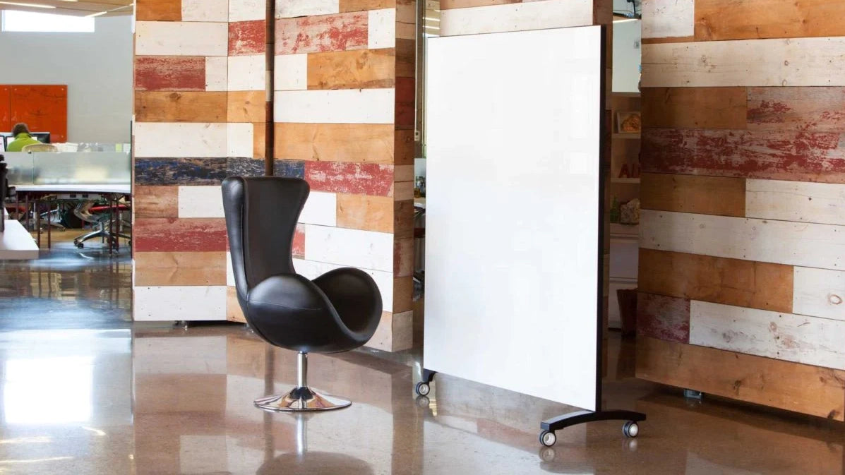
When using Go! Mobile, it’s quickly apparent how the product differs from a whiteboard. Because you’re writing on the glass in front of a background, the ink stands out and is clearly defined. As we were drawing, we learnt how Clarus’s glassboards are completely customisable – in colour, size and even with print graphics and logos. As it’s easy to clean and remains so, this is a perfect addition to the office – from the reception ‘doodle’ board to the high-octane boardroom meeting.

Humanscale turn the lights on
Humanscale’s new venture was a definite highlight and quite the change from their well-known ergonomic solutions. Vessel is an architectural lighting range that keeps to a beautiful, minimal aesthetic and marks a move towards a more residential feel with their products. The LED source is concealed above a high-quality quartz pendant. When the light beam is refracted downwards; the polished quartz tube creates an elegant glow.
True to Humanscale’s philosophy in ‘improving the human experience,’ this decorative light also focuses on the quality of light; producing a high colour rendering that’s glare-free. We see this working in a chandelier application for dining areas and boardrooms as a way of cultivating a warm style with sophistication.


